Friday, July 17, 2015

Failure: A Constant in Our Lives

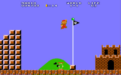
Mario, the training ground for failures (wait...)

I’ve been playing video games ever since I can remember. Around the age I was born, video games began to make their emergence into the average American home, so it shouldn’t be a big surprise that I was cutting my teeth on games like Super Mario Brothers, Duck Hunt, and The Legend of Zelda. The NES (Nintendo Entertainment System) held my attention for as long as my parents would allow. Due to a lack of funds (I was a kid) and frugal parents, we didn’t have a very large collection of games, so if my brother and I wanted to play, we’d have to persevere through difficult stages and adapt to controls that were, at first, a major challenge. Over time, we developed skills and patience, trying new things and mastering levels and uncovering secrets that were hidden for only the best players to find. Our early failures and our motivation in spite of the struggles enabled us to enjoy to the utmost the games we played.

In stark contrast, a few years ago, my niece would want to play my Mario games, but would quickly succumb to quitting or playing the same early levels over and over again in order to not face the challenge of further stages. She would even resort to handing the controller off to me, so that I could get through the difficult areas. My niece was so bothered by the idea of failing that she was more likely to give up or not even enjoy the game by playing it. The challenge and the risk of struggle outweighed the desire to progress or gain some expertise that would ultimately lead to her satisfaction and freedom in playing the game.

How often is this like us, especially as artists and craftsmen (or even in other areas of our lives)? The art world and how we are received can be a very intimidating thing, for sure, but are we really helping ourselves when we are terrified of failure? This fear of failure is so ingrained within our society that it forces people into modes of operation that prevent personal growth and promote a kind of lowest common denominator approach to living. I think that most motivated people eventually move beyond this stage of their life at some point, but for many talented and intelligent people the fear is stronger than the will and ends up choking out their reason and hope.

In fact, you can see it in schools. Most adolescents are afraid of ridicule to a certain degree (a form of “failure”) and end up stunting their growth as individuals and students in order to fit in with a certain crowd. They end up wearing masks and putting up shields so that their true selves will remain safe from the jabs and criticisms, while the outer facade is open to the blows. And the outer facade is much more capable of subverting any social destruction because it’s moldable and easy to change or ditch when the time calls for it. In my own life, I had a lot of growing to do in this area, as I found myself being different around different groups, in order that I would be accepted and praised.

Oh, high school, you're hallways are always so crowded

This may seem like it’s heading in the direction of “be your own unique little snowflake” territory, but that’s not where I’m trying to go. I’m more interested in subverting the notion that people shouldn’t fail. That failure is not an option. For sure, we aren’t hoping to fail. Shooting for failure isn’t commendable. However, knowing that we fail and accepting that we fail and learning from our failures instills upon us a confidence in the processes of life and growth.

I once heard a story of a professor who, during an assembly of students, declared that it was alright to fail. That many people fail in life at certain times and that it is through failure we can learn and become better. So, when a student fails an assignment, it gives that student time and motivation to reflect on why they failed and what they can do better next time. And that it is not the end of the world, but a step forward in their process of learning. This should give students hope that a failed class or a failed project will not stop them from getting better and even eventually producing great work. The students at the assembly were silent regarding this announcement, mostly due to the environment of the institute, which heralded results and success instead of learning. Another professor spoke up and declared that he, himself, had never failed a class and that he was proud of that accomplishment, because it proclaimed that he worked hard and was able to show what he was made of. The students applauded this announcement and fed the overwhelming ego of this professor.

So, it may come down to pride. Are we so proud that we are devastated by failures? Are we so proud that we can’t show when we are weak? If we look back at history’s greatest success stories and leaders, they aren’t filled with people who were afraid of failure. The greatest inventors built their lives around the notions of failure, submitting their minds and imaginations to the natural forces which ruled outside of their control. The social and national revolutions that brought great change and progress to the world were not held back by the idea of failure and, in fact, failed often. Abraham Lincoln is famously known for being a political failure for most of his career, yet he lives on in our history books as the greatest American president. Michael Jordan was cut from his high school basketball team, yet is now known as the greatest basketball player of all time. Albert Einstein could not speak fluently until he was nine years old and was expelled from school for being “slow”, yet he is now synonymous with genius. These are people who worked beyond their failures, using failure as a fuel for motivation and for strength, so that when the time for another challenge would come, they would then be prepared and ready to fight.

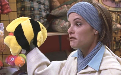
The Face of Failure

When failure happens, which it will, we can either be debilitated by it or treat it as a natural and common occurrence which will enable us to work past it, in order that we will not make the same mistakes again. There is no guarantee that we will have moved beyond whatever made us fall victim to failure, but there is the hope that we will learn from that failure and make the required changes, enabling us to grow and blossom.

In closing, I think humility is a much stronger antidote to the failures of life than pride. The person who fails while in a state of pride and glory, will take a much larger fall than the person who knows their humble status and works with confidence towards their goals. As they say, the bigger they are, the harder they fall. When we know we will fail at times, we are comfortable with moving forward afterwards, using what we have learned in the process. The hare was much more capable of winning the race, but fell into laziness because his confidence was derived from his pride in his abilities. He was not teachable. He thought that the whole race was no contest because he was so overqualified. Yet he lost. The tortoise, facing failure, still worked steadily, striving and moving, losing and losing and falling behind. In the end, the tortoise won. Not because of some intrinsic quality, but because in the face of failure, he moved forward. Meanwhile, the hare lost and couldn’t take the failure, because it pulled the rug out from underneath him. He went on to a life of heroin addiction. Or something. I may be confusing my tales here.

Look at the self-satisfied smugness. The tortoise has your number, man!

I’ll end with a nod towards Van Gogh, since this is an art blog and all, a man who is renowned as the cream of the crop of modern artists and the face of artistic genius. One of the most brilliant artistic minds in history was a huge failure. His paintings never sold, but for one to a relative. His style wasn’t respected. His life was lived in poverty and mental anguish. His dreams of being a missionary and evangelist, proclaiming the Gospel, were brought to an end when he was fired as a preacher. His life was, in all respects, failing. Constant failure. Yet most people don’t realize that he was always working on his art. His art wasn’t incredible from the get-go, like most everyone thinks. For sure, he had a tremendous ability, even early on (especially in the honesty of his work), but it was due to his endless studying and working that his art became so magnificent. As you struggle, as you debate with yourself, as you face failure, know that you’re not alone. In fact, you’re in good company.


"I've missed more than 9,000 shots in my career. I've lost almost 300 games. 26 times, I've been trusted to take the game-winning shot and missed. I've failed over and over and over again in my life. And that is why I succeed." Michael Jordan
Thursday, July 16, 2015

Vocab Lesson: Impasto

Van Gogh, making pretty pictures.

Impasto the thick application of a pigment to a canvas or panel in painting; also :  the body of pigment so applied (from Merriam-Webster)

No new painting student ever goes the impasto route (unless we're talking finger-painting pre-schoolers). Paint is expensive, money is tight, and being liberal with the tubed goo doesn't seem to make sense. Even I was victim to the thin paint blues, not knowing what I would do with so much paint and afraid to be too forthright with my approach. I was even guilty of using my brushes on the canvas in a way that suggested the technique of a house painter, doing the ol' back and forth action. Don't be like that. Live a little!

At the very least, it is good practice to forget about the cost of paint for a moment and just take the plunge into impasto technique. This is especially true for those that are attempting short still life studies or plein air painting, as time is a factor. The more paint you use, the quicker you'll be towards a finished-looking painting. Even if your overall painting style develops into a more subdued and thin application, you'll have had the experience of utilizing larger swaths of paint, giving yourself more feel for what the medium can do, and what may or may not work well.

Rembrant, an early pioneer of thick paint techniques.

For a real foray into the technique, find a way to work with your palette knife as your applicator, instead of a brush. You'll really challenge the way you understand the function of the paint, especially as a vessel for tone, color, and plane change. Interesting textures will arise and you'll find yourself absorbing so much more knowledge of the materials than you would had you simply resigned yourself to doing the same old thing. Don't do the same old thing.

Also, try hog hair! That will get you some nice meaty textures. If you want to paint anything similar to Lucian Freud's most famous works, you'll need to get some hog hair brushes. Make sure to scoop that paint and don't mess with it after it hits the canvas. Just let it sit. If it's not sitting right, don't be afraid to wipe it off. Just don't push it around.

Lastly, remember that oil paint should be applied fat over lean. This means that the layers closer to the canvas should be thinner than the layers on top. This allows the oils in the paints to sit more comfortably and reduces the amount of cracking that can happen as paint dries. Impasto is a perfect approach in regards to this information, so give it a shot. If you want to make sure you're getting things looking correct before you go nuts with the paint, just do a simple underpainting and slowly gear yourself up for the bold moves you'll be making later. I think you'll soon see that paint is very versatile and has qualities that are not seen as clearly or with as much appreciation as when it is applied with some thickness.

Cordelia Wilson, exhibiting impasto technique with subdued colors

Wednesday, July 15, 2015

Adam’s Approaches to Art: Artist's Block

Artist’s Block. It’s the bane of every artist everywhere. Worse than that stupidly annoying stray hair in your paint. You just want to make art, but for some reason you don’t have the motivation or the inspiration to make it happen. All you have is a brain that feels like it is imploding and an imagination that is sputtering and wheezing. If this sounds like you, you are not alone. It happens so often in our little art world that almost anyone can relate to it.

What can cause it and what can we do about it? I have a few notions regarding artist’s block that I think may help. Let’s go through some causes and ways in which we can combat these situations.

Leonardo was brilliant because he worked and worked and worked

The Brilliance Dilemma

Alright, so you’re standing at your easel, a canvas sitting in front of you, paint to your side, and all you want to do is produce a quality piece of work. You want to bring something to life, you want to wow your friends and relatives, you want to make something that’s never been seen before, and you want to let it come from the pit of your soul. That’s a tall order. But isn’t that how the greatest artists work? They’re just so brilliant that they produce work of the highest quality by letting their paint and brush become a vehicle through which their spirit descends upon the face of the canvas, anointing it with a beauty so pure and definitive that books are written about it and the masterful painters that produce it. If this sort of thing ever crosses your mind, I think you may be coming at art from the wrong perspective.

Art is editing. In every way, from concept to finish, the artist must be editing. To think that art just happens is unrealistic. This should not prevent you from creating art, but should propel you to take chances and work consistently. Feel free to sketch, experiment, mess with colors, paint to your heart’s content, but don’t expect that you can stand at a canvas, void of ideas or preparation and create a work that will engage your audience or fulfill your expectations.

Is this the state of your visual understanding?

The Vacant Mental Library

Art requires knowledge. Knowledge of colors, lines, marks, subjects, structure, proportion, juxtaposition, composition, perspective, intent, expression, visual grammar, vocabulary, intuition, communication, materials, etc. From abstract art to the most intense realism, artists must exercise some form of knowledge in order to produce their work. To approach your art without knowledge will only cause frustration. Research, practice, experiment, find reference, sketch. Do these things and you will begin to create a mental library from which you can draw in order to produce art that reflects your intentions. You’ll learn more about the world around you and you’ll feel more comfortable in your creations.

Stuck in a Moment

Analysis Paralysis and the Curse of The Masterpiece (feat Nancy Drew?)

The artist that only wants to make a masterpiece will find themselves frozen. I think this is the most common reason for artist’s block. As artists study history and view the impressive works of their heroes, it isn’t hard to become enamored with the idea of the “masterpiece”. The mind is overcome with ideas and paths and options and subjects, but none of them measure up to what the artist thinks will contribute to the world of art. In the world of board games, this is called “analysis paralysis”. The gamer is so overwhelmed with options and consumed with getting the highest score that they are afraid to make a move and instead weigh their options for a prolonged amount of time, making the game run long and the fun run short. When we find ourselves doing this in art, we have to break ourselves of it because we’re just preventing ourselves from growing as artists and from producing art. And we’re sucking the fun out of it.

"This is a fish!"

The Busy Bee

Our world is different than it was in the time of the masters. In many ways, life has been made more convenient, bringing an ease to things that were once very taxing and time-consuming. Yet, with all of our technological advancements, we still find ourselves gasping for air and overwhelmed by responsibilities and arrangements. We should probably take a step back and view the ways in which we spend our time, with a critical eye towards cutting fat. Does the cell phone consume your every waking moment? How about facebook? Or twitter? Maybe it’s Netflix. Or Amazon. Or you-name-it. All of these things vie for your attention and fill your brain. Some of these things can be good, giving you inspiration in different ways, but often they aren’t used properly and end up choking our creativity and our imagination. If this doesn’t happen to you, disregard this point, but hopefully you give it some thought. Find time to breath in the wonder of life, the simple pleasures, the classics, the timeless. You may find yourself recentering a bit and enjoying life more, freeing up your schedule and your mind to create art that reflects your spirit.

In Closing

By no means is this an exhaustive list of why you are experiencing a block in creativity. These are just some simple notions that often contribute to those moments. I hope that some of this spoke to your situation and you find yourself growing in these areas. Pursue what is good for you and keep at it. You’ll have peaks and valleys, but those times when you hit your stride are going to be fantastic.

Monday, July 13, 2015

Tuesday's Tip

Tip #1 - Make Confident Marks

When applying paint to the canvas or when laying out charcoal to paper, don't be afraid to try large and dynamic strokes. A single line defining a contour or a strong shape defining a tone will be read as more natural and confident than sketchy application. It will also build your own confidence. Remember the old adage, "measure twice, cut once". Measure it out and mark it once. Think about that mark you want to make and be confident in yourself to deliver on it. You'll soon find that the more you work in this manner, you'll be making the art that you want to make, you'll be surprising yourself with your art, and you're capabilities will blossom.

Bonus tip: Listen to music while you work and feel the rhythm. Oftentimes my best marks come when I'm drawing or painting to the rhythm of the music.

Painter's Pad: The Limited Palette

Welcome to the Painter's Pad.

This little corner of OTIKHTD (big acronym; debating a name change) is all about painting, believe it or not. It's not about pads.

Today's Painter's Pad is all about the limited palette, not to be confused with a limited palate, which would be a serious bummer. What is a limited palette? Well, you know that thing that the guy with the big afro and tender smile holds while he paints wonderful decor works of mountains and grass and cozy cottages and happy accidents? That's a palette.

That's a huge palette.

But the idea of a palette goes beyond the physical wooden board. It's really the colors that you are using. The colors on your palette ARE your palette. It's palette inception.

So, if you think about a palette being limited, you should be envisioning a palette with only a few colors. Initially, this would seem very intimidating. It would be like giving a chef some meat and cheese and a tortilla and telling him to invent a meal. Which is pretty much all of Mexican food. What at first seems a bit like wearing handcuffs is actually much like wearing a sensible pantsuit. You go into it thinking it may be uncomfortable, but end up wanting to fill your closet with them. I've kind of lost my way in these analogies.

The limited palette for those without a limited palate.

Most limited palettes rely on variations of the primary colors. Elementary art would teach you that yellow and red make orange, red and blue make violet, and blue and yellow make green. Elementary art is smart. They taught you well. From a limited palette of three colors, we have easily made six. Of course, you can vary the amounts of each color that you blend in order to create even more variation. And then you can blend those colors to string even more colors out. If you went crazy with it, you could be like a magician pulling a color spectrum scarf out of your sensible pantsuit.

One of the great artists of our time, Corky St. Clair

The pure grace of White helps in all of this. For instance, you may start out with yellow ochre (your yellow), burnt sienna (your red), and ultramarine blue (your blue). From these colors, you will begin to blend and get more varieties and hues. You will even benefit from blending some of the colors from opposite ends of the color spectrum (known as complementary colors) to find interesting neutral hues. Then, you can string all of your colors out by slowly mixing white into your color creations, producing a range of hues that are really all you could need for a gorgeous painting.

And the beauty of it is that because you started with only three colors and a tint (white), your invented colors will all act harmoniously. It's very similar to music. A song in a chromatic scale (using all of the notes) is far more dangerous and easy to screw up than a song within a key, utilizing a specific scale, with only a few chords and variations on those chords. I feel like my analogies are improving.

A self portrait by Lucian Freud, utilizing a limited palette and some hog-hair.

Look at the above image by Lucian Freud. These colors harmonize very well and you end up with a portrait that is very neutral looking, with maybe a greenish-brown overall hue. But, if you look closely at the colors that he is using, you begin to see the reds and the blues and the variety of colors that he found using a very limited palette. You see the same effect in most artists' works. It is our brains and our eyes that trick us into thinking the artist is probably using a cavalcade of different paints. Below is a Degas. At first glance it is simply a remarkable painting with a host of different tones and shades and colors, but upon closer inspection you will start to find that same effect of harmony which a limited palette brings. He's not using a bunch of different reds or yellows or greens or blues. He's creating them through mixture and tint. 

Degas being De Man (sorry, that's inexcusable)

And, lest you think all limited palettes be drab, here's a limited Monet

The strength in the limited palette lies in its flexibility within its dependable constraints. Using the colors I chose above, I would create a vastly different feeling than if I used cadmium yellow, cadmium red, and pthalo blue. There are a wide variety of yellows, reds, and blues in the painter's repertoire, so the combinations begin to open up and seem limitless. Especially when you consider the fact that a grey can be your yellow or your blue or your red, depending upon color relationships and relativity. But I will save that for another post.

For now, focus on experimenting with your limited palette and finding what you can accomplish within it. Try different yellows, reds, and blues. Introduce one other accent color. Be adventurous. Be courageous. Be fun.

Tuesday, November 11, 2014

Perspective

Perspective and proportions tend to go hand-in-hand. If you have one correct, it's pretty easy to get the other going in the right direction. Really both aspects of art are most concerned with angles and how shapes and masses interact and relate with each other.

But perspective, as we understand it today, wasn't always in the bag of artist tricks. In the past, there was a more natural approach to it, observing relationships without adhering to a scientific application of measurement. This was an organic perspective, one which is readily observable in pre-Renaissance paintings. In many instances, artists still utilize the method of observing angles without implementing linear perspective techniques. Usually with smaller studies (still-life or figure, for instance) an artist may not need to employ linear perspective approaches.

What is linear perspective? It is a method discovered and utilized throughout the Renaissance by artists whose goal was to replicate more exactly how we see things within our picture plane. It is based within a geometric and mathematical system of measurements, which can give precise angles of objects. The simplest method of understanding linear perspective is to see "one-point perspective". Imagine a line of telephone poles traveling into the distance. Eventually they meet the horizon, at a certain point. You can trace a line from the top of the nearest telephone pole straight to the point on the horizon and, if each pole is of the same alignment and height of the nearest, you'll trace along the top of each pole. The same thing would happen if tracing from the bottom of the nearest pole straight to the point on the horizon. The following diagram (from Paul Heaston) shows how this works.


This diagram also shows "two-point perspective" in how the cross-bar follows a different line to a different point. So, with two points on the horizon line, we can create a realistic understanding of perspective and replicate what we naturally see, through the use of math.

This can be used to highlight something important. For instance, Da Vinci uses one-point perspective to center The Last Supper on Jesus Christ, bringing all of the focus to the primary subject. You can see that he reinforces his perspective with a grid on the ceiling and divisions within the walls.


Scorsese uses this technique in Raging Bull to highlight the most crucial moment of Jake LaMotta's fight against Sugar Ray Robinson. All of the focus is on Sugar Ray. The whole arena seems to converge on him, and him alone. We are seeing him from the perspective of Jake and we see how powerful Sugar Ray is. We feel the importance of the moment.


Along with linear and organic perspective, we can show perspective in other ways, too. We can show it simply by overlapping objects. Closer objects will obscure further objects and this will clue in the viewer that there is a distance between the two. Some artists purposefully compose a "flat" scene in which perspective is downplayed. Wes Anderson is famous for "flat" compositions, which read more like a stage-play than an immersive experience. We find ourselves observing the acting and production, rather than feeling like we are in the moment with them.


Compare this to the storyboards for Alfred Hitchcock's Vertigo. We feel the character's confusion and tension. We are in the character's shoes. Each shot is full of overlapping objects and dynamic angles. This brings us right into the scene. We're not merely observing a character - we are the character!


These storyboards show us something called atmospheric perspective, as well. Observable in most of the thumbnails, but most noticeable in the image with the falling woman, we see that objects closer to our view have a higher value range than those further from our view. The man's hair is a dark black and the highlights on his face are a bright white, while the woman is simply varying degrees of grey. This occurs in real life. Let's imagine we are driving in a car. We see our dash, the land around us, and distant mountains. The shadows in the controls of our dash are going to be close to black, while the sunlight creates some high values on the brightest portions of our car. We are able to see a higher variety of values. If we look at the land around us, we will notice that the shadows aren't nearly as dark and the highlights are actually a bit lower in value than the ones that are nearest to us. And the distant mountains are essentially one value or maybe two, but there really is not much contrast.

In this image, you can see that the nearest rocks have darker shadows and brighter highlights than the middle-ground, and that the furthest mountains are essentially one tone. There are small exceptions, such as the snow in the mountains, however we must remember that snow is a far amount whiter than these grey-brown rocks. Atmospheric perspective does take the whiteness of the snow down quite a bit though. We can see that it is not absolutely white, but a sort of grey-blue white. An amateur artist would be tempted to paint the distant snow as pure white, but we now know better.

Thickness of line can also illustrate perspective. Line, of course, is typically used in contour drawings. Contour drawings don't exactly lend themselves to differing value-tones in the same way that paintings do, so there are different methods of establishing perspective with only line.


You can see here, that Rembrandt brought thicker lines to his foreground and thinner lines to his background. This is a very good way of establishing perspective through line-work. He also uses various methods of hatching to create shapes of value, in order to differentiate between the shapes in the middle-ground. This can be incredibly difficult to master and takes lots and lots of practice to get efficient at, but it is definitely worth knowing.

So, as you can see there are many ways to approach perspective and it is a tough beast to wrangle. It is important for artists to practice it often, even when they think they know it all (which is never a good mindset for an artist).
"The divisions of Perspective are 3, as used in drawing; of these, the first includes the diminution (reduction) in size of opaque objects; the second treats of the diminution and loss of outline in such opaque objects; the third, of the diminution and loss of color at long distances." - Leonardo Da Vinci

Wednesday, October 22, 2014

Proportions

Van Gogh - Skull

(Please note that the works I show throughout this article were done by men who are known more for their journeys into abstraction rather than intense detail, while still adhering to representative painting. This is to illustrate the greater importance of generally correct proportions rather than strict detail.)

Correct proportions solve many drawing problems. They are the basis of our understanding of what an object is. If I can understand the shape of an object along with how it looks in scale to another object, I'm well on my way to having a proper understanding of what I am seeing. In fact, due to the high proficiency of our brains in learning and cataloging what we see and experience, oftentimes we can calculate what an object is even while it is partially obscured or seen with blurry vision. So, the artist is at an advantage if he or she can express their subject with good proportions.

This is easier said than done, of course, but it should take some of the pressure off of the artist, in that there will be some emphasis taken off of the details. While it is certainly true that a detailed work can be impressive and that the "devil is in the details", so to speak, there is a reason that artists through the ages have taught a general-to-specific approach to their work. More important than the details are correct proportions and relationships. Think of Cezanne or a Monet - they are convincing their audience while only relaying limited information.

Cezanne - La Mont Sainte Victoire

Monet - Waterloo Bridge

In my experience, even the most amateur artist can have a successful drawing, just by representing their subjects with good proportions. The angles can be off (although good proportions will generate good angles; and vice versa), the line quality may be off, the light and shadow may not be rendered very well, or any other variety of problems may plague the work, but good proportions will relay the information needed by the audience to understand what they are looking at.

Proportions are essentially measurements. There are different ways to go about taking these measurements and applying them to your work. I use one of two different methods depending on my subject matter and style. One is the technique I've used most of my life. It involves picking a point and working out from it - for instance, I may be drawing a face and will choose to start with the eye and slowly work out from it, in different directions, measuring intuitively and based upon what I've already marked. This method is not easy and can quickly go awry, being unnoticeable at first, but evident at the end, as shapes are a little wonky or angles are a little off. The reason being that it is more difficult to see the whole, when you are so focused on the parts. If you have a skilled eye, you may not run into this issue. I never had much of a difficulty with it. This is typically a good approach when dealing with copying from a 2D source.

However, as I have received more education, challenged myself by drawing from life, and diversified my styles, I have had to employ the more traditional approach of moving from large shapes to small shapes. The best way to measure proportions in this way, is to work with angles. Seeing relationships between outer edges and inner edges, rhythmic lines, how parts fit with each other, and just attempting to be accurate with shapes are the keys to measuring with this method. It's difficult to explain with words, but is more obvious in action. This method requires drawing lightly, connecting points to other points, and slowly building the subject up by establishing where the planes are and how they relate to one another. This is a fantastic approach to establishing general proportions and initial composition, as it declares immediately what it is that you are drawing.

Hopefully later on I can post a video or step sequence to show exactly what I mean by both of these techniques. In the meantime, try to experiment with both approaches and train yourself to loosen up and communicate the whole, rather than the parts.

"Art, like morality, consists in drawing the line somewhere." G.K. Chesterton