Showing posts with label rembrandt. Show all posts

Thursday, July 16, 2015

Vocab Lesson: Impasto

Van Gogh, making pretty pictures.

Impasto the thick application of a pigment to a canvas or panel in painting; also :  the body of pigment so applied (from Merriam-Webster)

No new painting student ever goes the impasto route (unless we're talking finger-painting pre-schoolers). Paint is expensive, money is tight, and being liberal with the tubed goo doesn't seem to make sense. Even I was victim to the thin paint blues, not knowing what I would do with so much paint and afraid to be too forthright with my approach. I was even guilty of using my brushes on the canvas in a way that suggested the technique of a house painter, doing the ol' back and forth action. Don't be like that. Live a little!

At the very least, it is good practice to forget about the cost of paint for a moment and just take the plunge into impasto technique. This is especially true for those that are attempting short still life studies or plein air painting, as time is a factor. The more paint you use, the quicker you'll be towards a finished-looking painting. Even if your overall painting style develops into a more subdued and thin application, you'll have had the experience of utilizing larger swaths of paint, giving yourself more feel for what the medium can do, and what may or may not work well.

Rembrant, an early pioneer of thick paint techniques.

For a real foray into the technique, find a way to work with your palette knife as your applicator, instead of a brush. You'll really challenge the way you understand the function of the paint, especially as a vessel for tone, color, and plane change. Interesting textures will arise and you'll find yourself absorbing so much more knowledge of the materials than you would had you simply resigned yourself to doing the same old thing. Don't do the same old thing.

Also, try hog hair! That will get you some nice meaty textures. If you want to paint anything similar to Lucian Freud's most famous works, you'll need to get some hog hair brushes. Make sure to scoop that paint and don't mess with it after it hits the canvas. Just let it sit. If it's not sitting right, don't be afraid to wipe it off. Just don't push it around.

Lastly, remember that oil paint should be applied fat over lean. This means that the layers closer to the canvas should be thinner than the layers on top. This allows the oils in the paints to sit more comfortably and reduces the amount of cracking that can happen as paint dries. Impasto is a perfect approach in regards to this information, so give it a shot. If you want to make sure you're getting things looking correct before you go nuts with the paint, just do a simple underpainting and slowly gear yourself up for the bold moves you'll be making later. I think you'll soon see that paint is very versatile and has qualities that are not seen as clearly or with as much appreciation as when it is applied with some thickness.

Cordelia Wilson, exhibiting impasto technique with subdued colors

Tuesday, November 11, 2014

Perspective

Perspective and proportions tend to go hand-in-hand. If you have one correct, it's pretty easy to get the other going in the right direction. Really both aspects of art are most concerned with angles and how shapes and masses interact and relate with each other.

But perspective, as we understand it today, wasn't always in the bag of artist tricks. In the past, there was a more natural approach to it, observing relationships without adhering to a scientific application of measurement. This was an organic perspective, one which is readily observable in pre-Renaissance paintings. In many instances, artists still utilize the method of observing angles without implementing linear perspective techniques. Usually with smaller studies (still-life or figure, for instance) an artist may not need to employ linear perspective approaches.

What is linear perspective? It is a method discovered and utilized throughout the Renaissance by artists whose goal was to replicate more exactly how we see things within our picture plane. It is based within a geometric and mathematical system of measurements, which can give precise angles of objects. The simplest method of understanding linear perspective is to see "one-point perspective". Imagine a line of telephone poles traveling into the distance. Eventually they meet the horizon, at a certain point. You can trace a line from the top of the nearest telephone pole straight to the point on the horizon and, if each pole is of the same alignment and height of the nearest, you'll trace along the top of each pole. The same thing would happen if tracing from the bottom of the nearest pole straight to the point on the horizon. The following diagram (from Paul Heaston) shows how this works.


This diagram also shows "two-point perspective" in how the cross-bar follows a different line to a different point. So, with two points on the horizon line, we can create a realistic understanding of perspective and replicate what we naturally see, through the use of math.

This can be used to highlight something important. For instance, Da Vinci uses one-point perspective to center The Last Supper on Jesus Christ, bringing all of the focus to the primary subject. You can see that he reinforces his perspective with a grid on the ceiling and divisions within the walls.


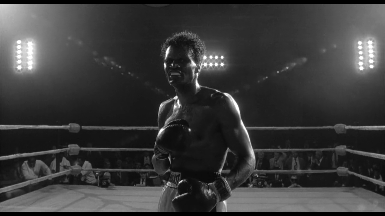
Scorsese uses this technique in Raging Bull to highlight the most crucial moment of Jake LaMotta's fight against Sugar Ray Robinson. All of the focus is on Sugar Ray. The whole arena seems to converge on him, and him alone. We are seeing him from the perspective of Jake and we see how powerful Sugar Ray is. We feel the importance of the moment.


Along with linear and organic perspective, we can show perspective in other ways, too. We can show it simply by overlapping objects. Closer objects will obscure further objects and this will clue in the viewer that there is a distance between the two. Some artists purposefully compose a "flat" scene in which perspective is downplayed. Wes Anderson is famous for "flat" compositions, which read more like a stage-play than an immersive experience. We find ourselves observing the acting and production, rather than feeling like we are in the moment with them.


Compare this to the storyboards for Alfred Hitchcock's Vertigo. We feel the character's confusion and tension. We are in the character's shoes. Each shot is full of overlapping objects and dynamic angles. This brings us right into the scene. We're not merely observing a character - we are the character!


These storyboards show us something called atmospheric perspective, as well. Observable in most of the thumbnails, but most noticeable in the image with the falling woman, we see that objects closer to our view have a higher value range than those further from our view. The man's hair is a dark black and the highlights on his face are a bright white, while the woman is simply varying degrees of grey. This occurs in real life. Let's imagine we are driving in a car. We see our dash, the land around us, and distant mountains. The shadows in the controls of our dash are going to be close to black, while the sunlight creates some high values on the brightest portions of our car. We are able to see a higher variety of values. If we look at the land around us, we will notice that the shadows aren't nearly as dark and the highlights are actually a bit lower in value than the ones that are nearest to us. And the distant mountains are essentially one value or maybe two, but there really is not much contrast.

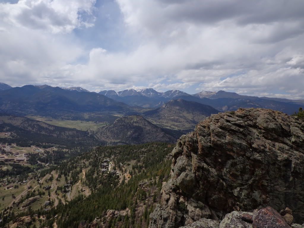
In this image, you can see that the nearest rocks have darker shadows and brighter highlights than the middle-ground, and that the furthest mountains are essentially one tone. There are small exceptions, such as the snow in the mountains, however we must remember that snow is a far amount whiter than these grey-brown rocks. Atmospheric perspective does take the whiteness of the snow down quite a bit though. We can see that it is not absolutely white, but a sort of grey-blue white. An amateur artist would be tempted to paint the distant snow as pure white, but we now know better.

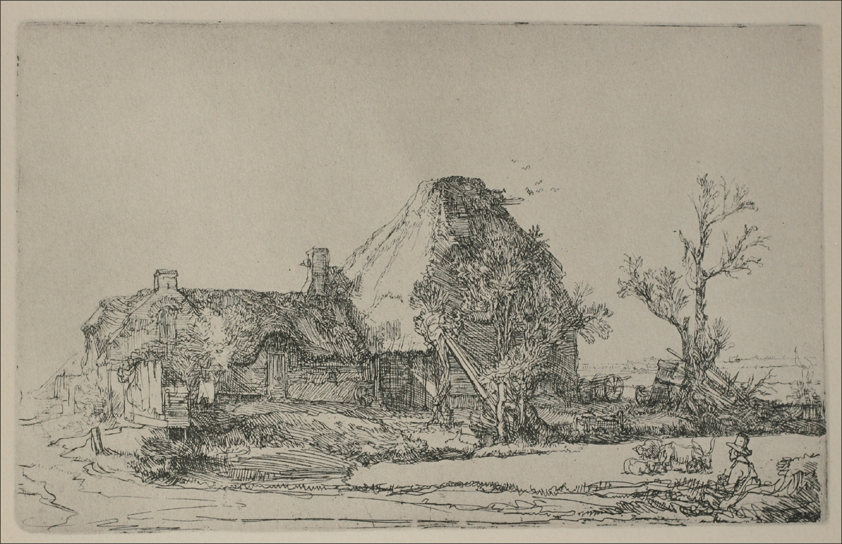
Thickness of line can also illustrate perspective. Line, of course, is typically used in contour drawings. Contour drawings don't exactly lend themselves to differing value-tones in the same way that paintings do, so there are different methods of establishing perspective with only line.


You can see here, that Rembrandt brought thicker lines to his foreground and thinner lines to his background. This is a very good way of establishing perspective through line-work. He also uses various methods of hatching to create shapes of value, in order to differentiate between the shapes in the middle-ground. This can be incredibly difficult to master and takes lots and lots of practice to get efficient at, but it is definitely worth knowing.

So, as you can see there are many ways to approach perspective and it is a tough beast to wrangle. It is important for artists to practice it often, even when they think they know it all (which is never a good mindset for an artist).
"The divisions of Perspective are 3, as used in drawing; of these, the first includes the diminution (reduction) in size of opaque objects; the second treats of the diminution and loss of outline in such opaque objects; the third, of the diminution and loss of color at long distances." - Leonardo Da Vinci

Wednesday, October 15, 2014

Line

Drawing by Rembrandt

Line is essential to all art. It is the first step in understanding how to represent an object on paper. No matter the subject, no matter the setting or composition, line is crucial to our drawings.

Line is not only drawn explicitly (as we may think of it), but it is also found implicitly, through the coming together of shapes and tones. Where the edges of objects meet space or each other (on the picture plane), line is implied.

As outlined by Andrew Loomis (in "Creative Illustration"), there are 7 primary functions of line.

1. To convey its own intrinsic beauty
2. To divide or limit an area or space
3. To delineate a thought or symbol
4. To define form by edge or contour
5. To catch or direct the eye over a given course
6. To produce a grey or tonal gradation
7. To create design or arrangement

It is important to understand how each of these functions work and how the artist can use them creatively. I will work backwards, starting with number 7.

7. An important part of creation is setting up the composition - the shapes on the plane and how they interact with one another. An artist can approach this function in a completely abstract way or in a way the takes into account true and perceived forms. This function can embody the sketching phase of art-making, when the artist is attempting to blueprint their design. The function can also relate to abstract formal and informal design, in arenas such as architecture or pottery.

6. Think of comic books. Or hatching. If you are familiar with these techniques and styles, you have witnessed grey or tonal gradation through the use of line. It is a way in which the artist can render three-dimensional forms without the use of flat tones and shapes, but only through the use of line and variation of line.

5. This goes in hand with some of the ideas I alluded to in number 7. Good compositional arrangements often rely heavily on how the artist can lead the eye of the audience. Think of the arrow on a street sign or the wanderings of the kid in Family Circus comics. These lines lead the eye. An artist can use line, either blatantly or subtly, to do the same thing. A good exercise is to find a drawing or painting you enjoy and break it down by drawing over it, finding the lines in a rudimentary fashion and seeing how and where the artist is leading your eye.

4. This is kindergarten stuff. When a child draws a house, it is a square with a triangle on top. The sun is a circle. The cloud is a few semi-circles arranged in a pattern. When a form or variation in form (contour) is represented by line, you are seeing this function in action.

3. Numbers and letters. This function is how we often see line used. It becomes a part of our nature and everyday existence to see line used this way. An artist may be able to use this function to their advantage, conjuring up the deep ideas that are hidden within these types of symbols. Think of $, *, #, @, etc. You'll find that these symbols tap into connotations that can be out of our control.

2. This one is tricky in practice. Think of how a backslash divides two numbers or a wall divides two areas. Think of how the horizon divides the ground from the sky or how a box contains its contents, dividing it from the outside world. You can get existential with this one. However, in practice it is worth noting that lines in artwork create tension when used to divide. You can very easily communicate two subjects being at odds by introducing a line. The reason this is tricky is because you can easily do it on accident and sabotage your own expression.

1. Line can be beautiful. The amount of variation you can achieve with line through bends, straights, wides, narrows, angles, curves, etc, is communicative in and of itself. The audience, without knowing why, like your drawing - with the only reason being how you achieved your line. Line quality is immensely important to achieving a visually compelling drawing, if that is the point of the work. As an exercise, try doing a blind contour drawing. Do not look at your drawing as you draw it, but only look at your subject. Really try to feel the weight of the contours, the shapes that are being made. When you are done, you will find that your drawing does not really hold up as a cohesive work, but that the lines you have created are beautiful nonetheless.

I hope to write more on how important line is to creating art, but for now I will leave you with a little encouragement regarding the creative process, from our friend Andrew Loomis. "Even a poor drawing exhibiting inventiveness and some originality is better than a hundred tracings or projections." Know that your work as an artist isn't about being like other people and isn't about copying things, but is about expressing what you find interesting in a way that is genuine to your own convictions.